Red – Exploring Power and Contrast in Monochromatic Photography
As part of my university degree—one step closer to my master's in design focused on photography—I shot this project to explore the impact of monochrome photography when a single colour dominates the entire frame. And red felt like the natural choice. It’s bold, unapologetic, and full of contradictions. Feminine and fierce. Romantic and confrontational. Red doesn’t sit quietly, and that’s exactly the energy I wanted in this series.
The concept came from my ongoing interest in power dynamics in portraiture – specifically, how traditionally masculine poses and attitudes shift when placed in a setting that leans overtly feminine. There’s an interesting tension in that space. I wanted to push that balance while keeping the images clean and direct, stripping away distractions so that every element served a purpose.
Let’s talk about the setup.
Camera settings
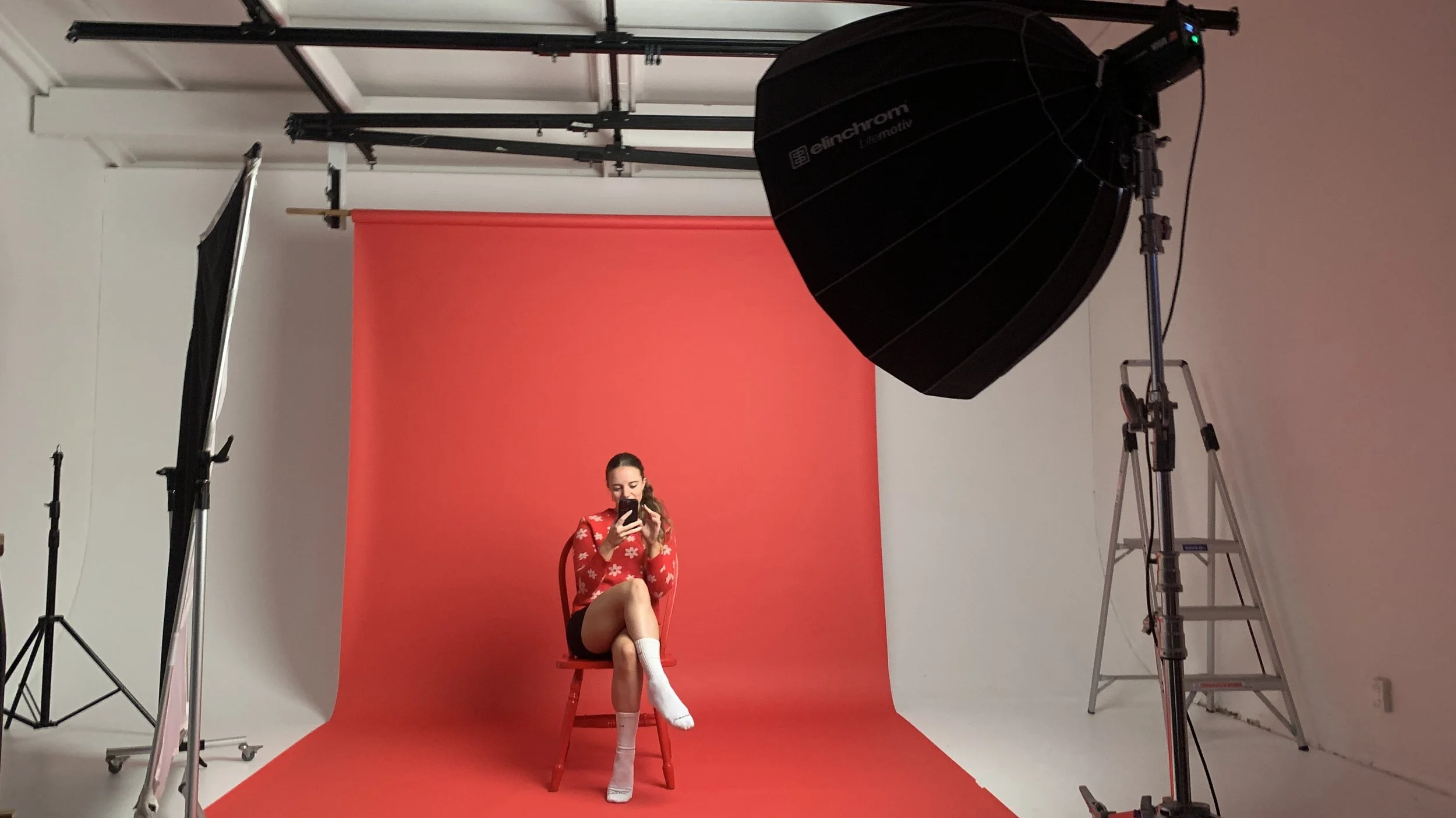
Camera body used: Canon EOS R
Lens: Samyang AF 85mm F1.4 Canon RF (Yes, I got my hands on one of the AF lenses before they were discontinued).
Camera settings: ISO 250-320, F16, 1/160 - 1/200.
Setting the scene

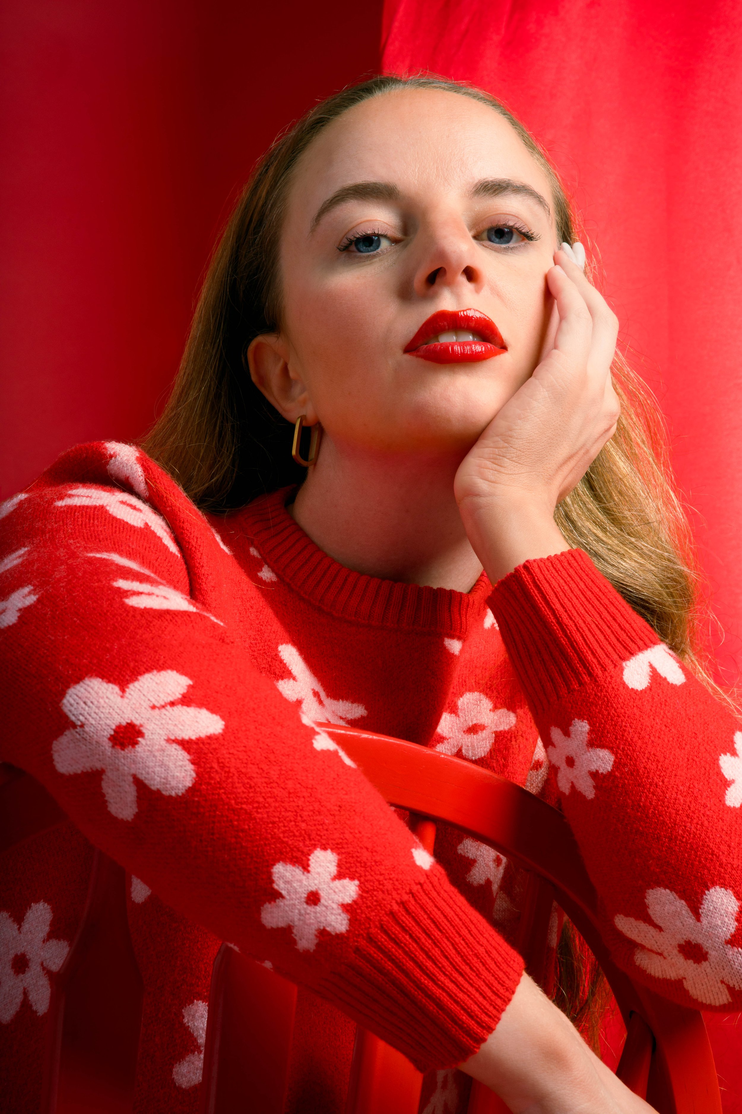
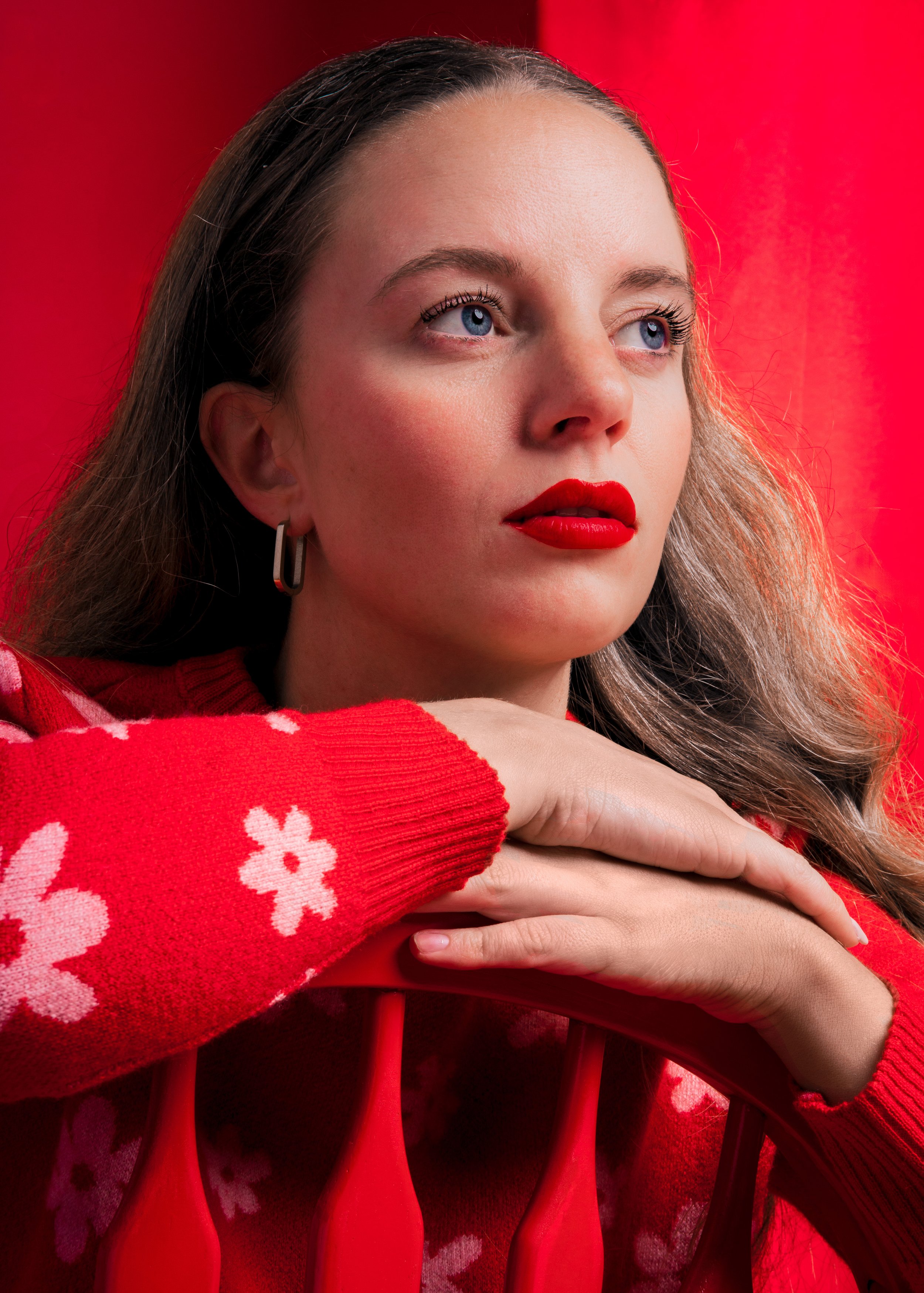
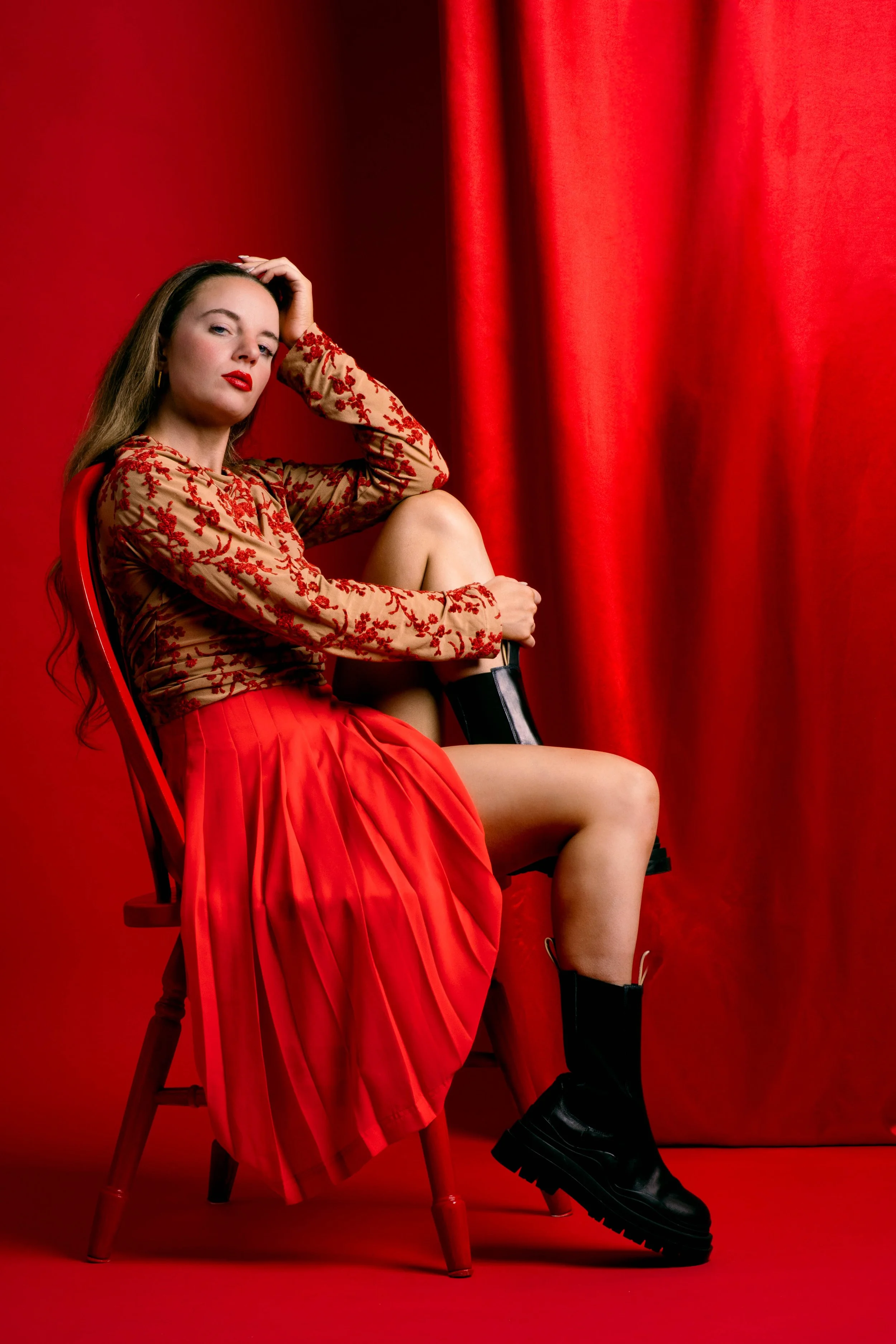
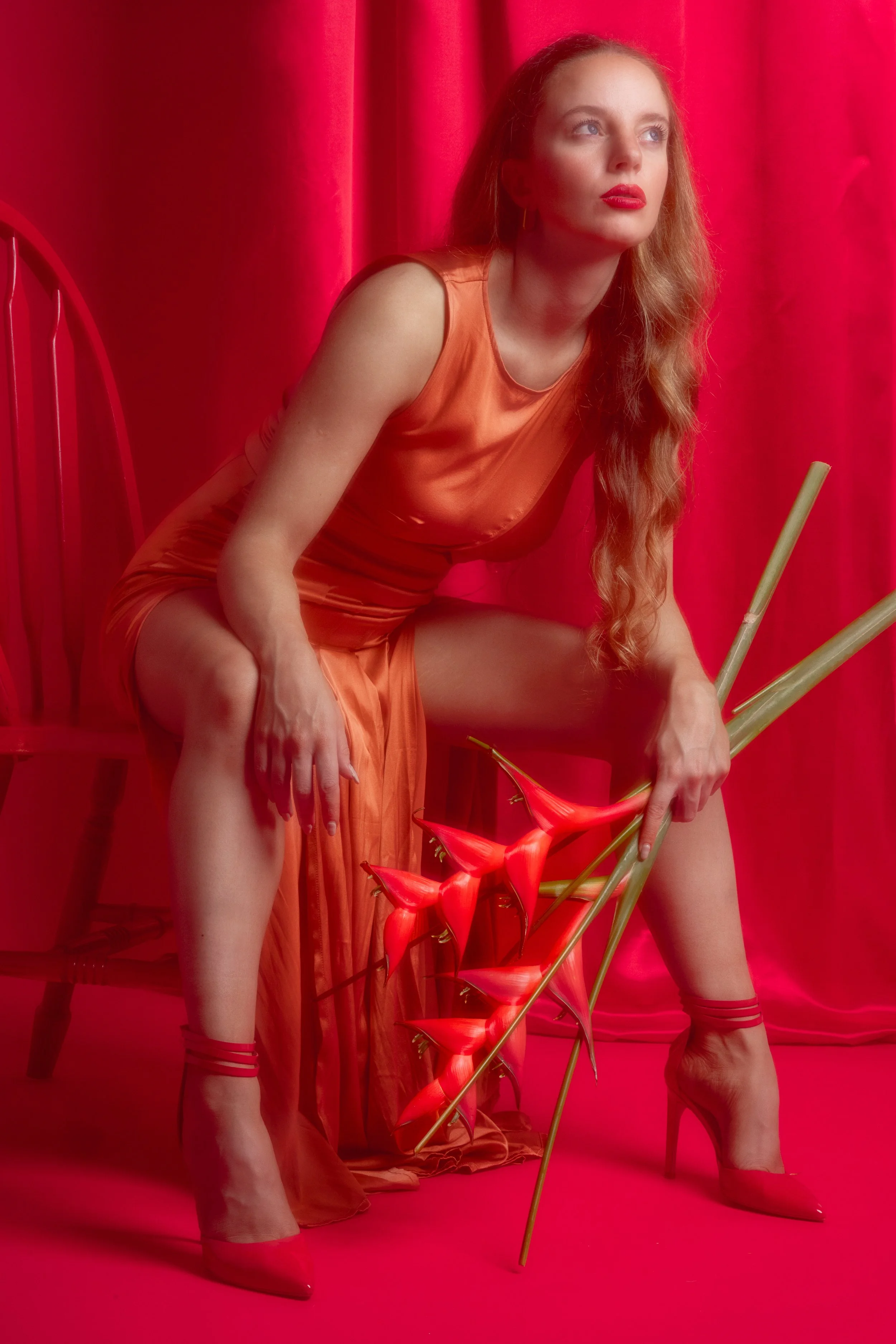
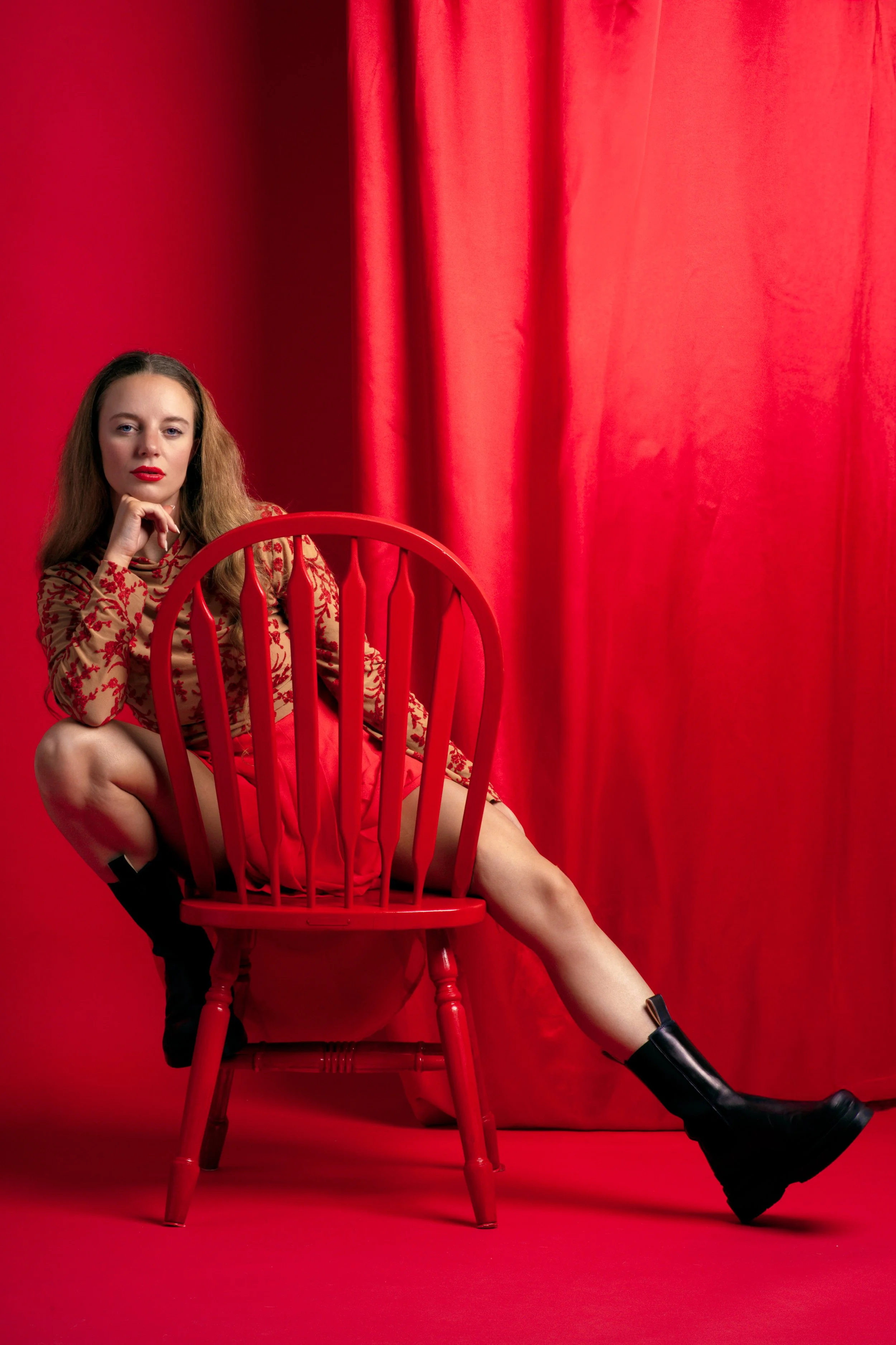
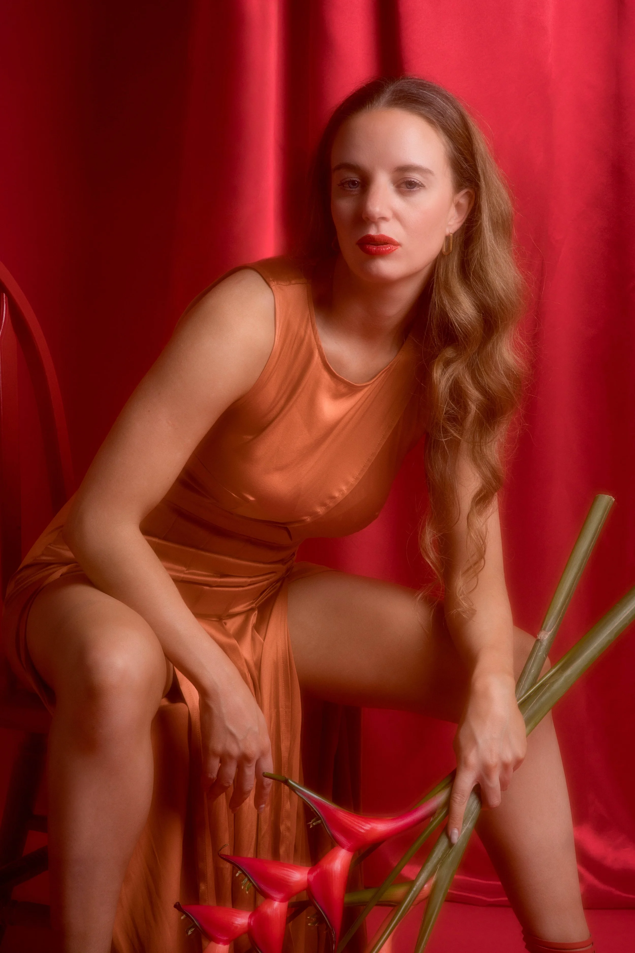
The set design was minimal on purpose – a chair, some flowers, a red curtain and some gauze over the lens for some later shots. Each prop was chosen for its texture and ability to interact with the colour red. The flowers were delicate but not soft; their sharp edges and saturated tones almost made them feel confrontational. The chair was spray-painted in a high-gloss red, which gave it this artificial, almost hyperreal quality. The gauze was my wildcard. It brought in an airy, imperfect texture that contrasted with the solid, structured elements.
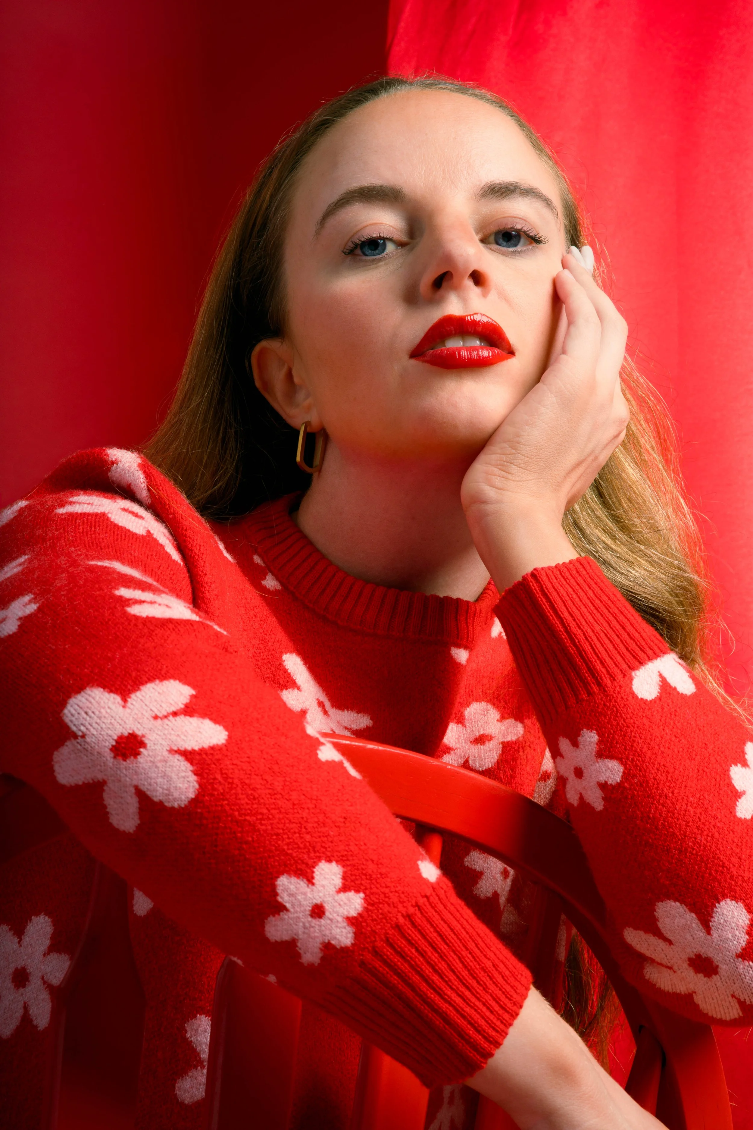
Lighting was key. I used a single deep and wide octobox (the Elinchrom litemotiv 120) positioned at a 45-degree angle for a Rembrandt-inspired look – a common lighting set-up in traditionally masculine portraiture. I controlled bounce with a white scrim to the right of the model. The shadows were curated – essential to the narrative, reinforcing strength often associated with masculine portraiture while keeping the overall tone soft. This balance was critical – too harsh, and the story would tip into aggression or feel contrived; too soft, and it might lose the strong femininity I wanted the subject to subversively embody.
Posing & Influence

I leaned heavily on traditionally masculine stances – slouched shoulders, direct eye contact, grounded postures. I was inspired by shots like Williams + Hirakawa’s portrait of Willem Dafoe, and the work of Sam Jones. And when paired with the red tones, delicate props and a female subject, those same poses began to shift. They didn’t feel strictly masculine anymore. They felt dynamic, layered, and ambiguous.
My influences for this shoot were a mix of the conceptual and the practical. Tyler Mitchell’s work is really focused on colour and texture. He does a wonderful job of using those elements to capture and develop his visual narrative, helping his stories to unfold without overcomplicating the frame. Nhu Xuan Hua inspired me with her use of textures, particularly how carefully chosen elements can create depth in an image.
The Challenge of Red
But here’s the thing about working with such a strong colour: it can easily overwhelm.
The challenge was letting red be loud without overpowering everything else. It came down to restraint. Minimal props, simple wardrobe. This shoot wasn’t about complexity, it was about focus.
Ultimately, this project was an exploration of contrasts: masculine and feminine, bold and soft, structured and fluid. It’s a reflection of how identity is never one thing – it’s constantly shifting, shaped by context and perception.
If anything, this shoot reaffirmed why I love working with strong colour concepts. They force you to be intentional with every choice. Red doesn’t let you hide behind distractions. And that’s where the magic happens.